Cat and Mouse Studio
  • Services
  • Portfolio
  • About
  • Contact
  • Resources
  • Services
  • Portfolio
  • About
  • Contact
  • Resources
Search

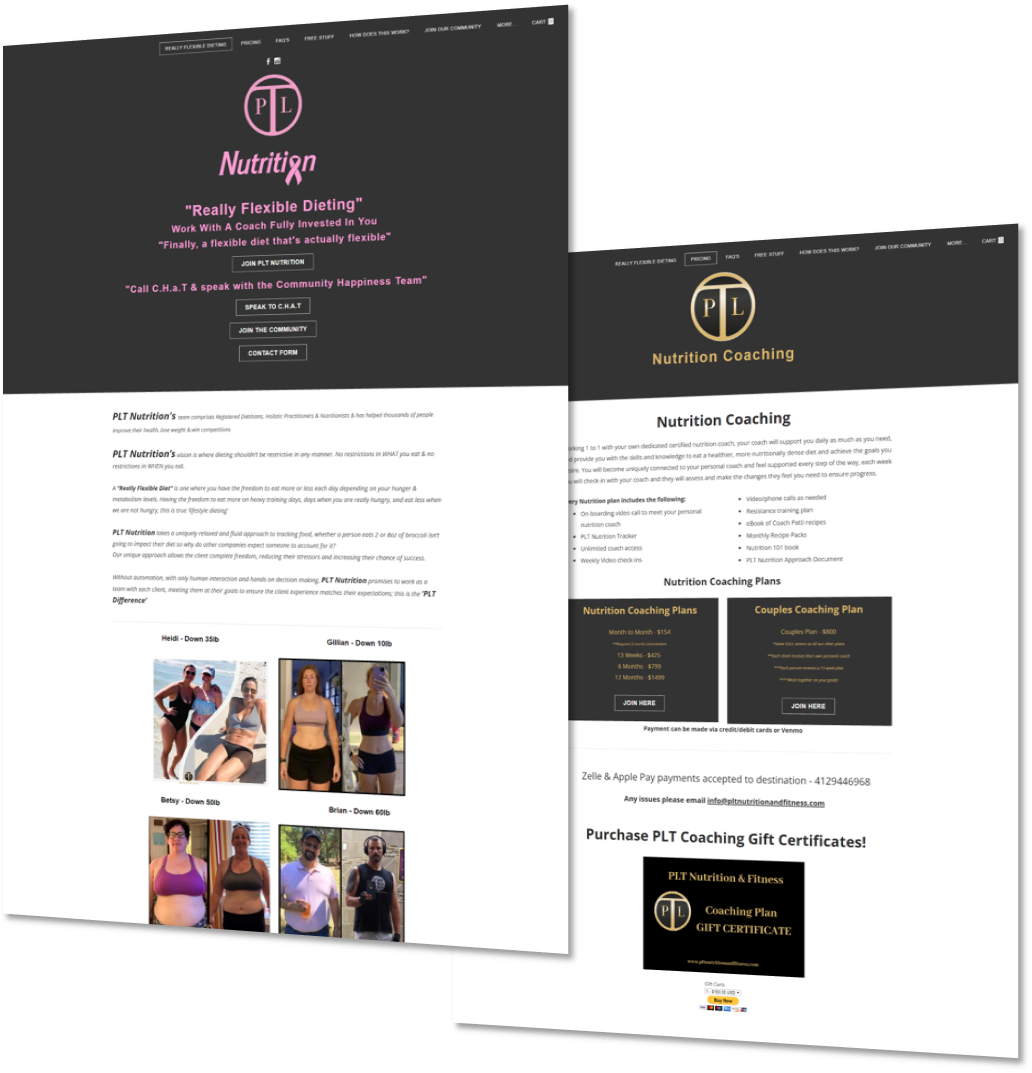
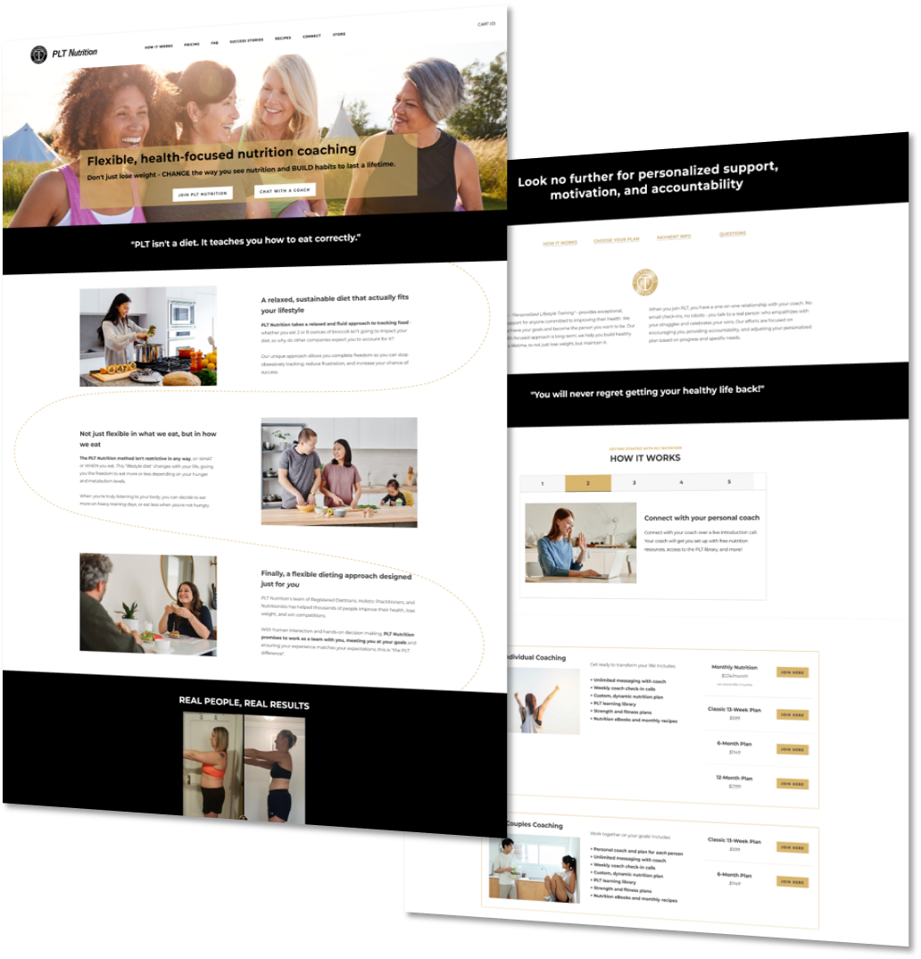
making a successful business shine.

This global nutrition company didn't have a website that reflected their status or described what made them unique from competitors. What started as a request for a "punchy and eye-catching" website evolved into a deeper look at the brand's values and demographics. The result was clean, professional, focused, and tailored to its niche audience.

before.

In Paul's own words:
"There are elements i am very unhappy with on my website... The website really has too much going on in general."
What wasn't working:
  • disorganized navigation and outdated links
  • too many CTAs on the homepage
  • not enough breathing room between elements
  • free recipes that were frustratingly difficult to access, let alone download
nutrition website with grey boxes and pink text

after.

"Yeahhhh I absolutely love that! The whole visual is soft and more feminine which is perfect as we are a very female centric company now... I showed the pages earlier to my management team and they were all in awe of how cool it is! It’s so nice!"
- Paul L., PLT Nutrition
Why the redesign works:
  • super clear CTAs to bring customers to a compelling pricing page
  • warm, friendly copy and stock photos to appeal to the right demographic
  • no-nonsense layouts and an organized footer to help customers find the right content faster
  • easy-peasy recipe downloads
modern, professional nutrition website with photos of women

get a website that fits YOU.


Like what you're seeing? Contact me today to start talking about what your website could do for you.

Send Me a Message
catandmousestudio.com

Services   ·   Quiz   ·   Contact   ·   Privacy   ·   Terms
​Cat and Mouse Studio © 2023
  • Services
  • Portfolio
  • About
  • Contact
  • Resources